Overdone Ad Agency Design Fries My Brain
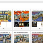
 I spend a lot of time looking at ad agency websites. I even have a Pinterest website that includes many (that’s it on the left.)
Soooo many are overblown, over baked, over jam-packed with copy and images. These websites also sound alike with about, work, process (‘our agency’s very own special sauce), client lists, photos of offices, contact pages, hip staff photos and long lists of services. Yes, I get it. These are logical sections. But doing what the other 4,000 ad agencies do is not very original.
I Am Beginning To Really Dig Minimalism
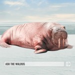
 I am not yet sure what I really think about Walrus‘ approach (i.e. the talking walrus.) BUT… it is minimal and does not look like any other agency and there is a bit of humor which is sorely missing in the advertising industry, so I will give it a mighty WOW.
2 Minimalist Inspirations
As visual food for thought, I offer these two websites to stimulate minimalist thinking.
1. Visit: 55 Minimal Black and White Web Designs to Inspire You
I offer this because it is a sweet list. The 55 Minimal website itself isn’t very minimalist. But, who cares. The owner wants to make a few bucks via advertising and the site has a surprisingly high Alexa rank of 13,575. Clearly, the idea of minimalism is popular (but, not in the land of ad agency websites).
2. Visit: Sold-Out.CH
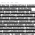
 Nice list. Nice name. Click on the image at left. The site includes a good idea for making lots of friends (see below.) My favorite parts: click the About link; see how this is just a front for the main website by going to Portfolio and add your website to the list. I did.
That’s it, folks. Gotta keep this blog post somewhat minimal.

Leave a Reply