I friend sent me to the funny infographic “The Anatomy of An Agency” from Canada’s Grip Limited. It’s at the bottom of this post. The infographic nails advertising agency culture and, based on the number of comments, got well distributed making it a much higher trafficked post that the great majority of agency blog posts. Most of them appear written for the agency itself or their close friends.
OK, nice job so far. I even like the blog’s editorial content in general.

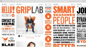
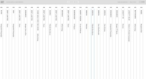
 OK, a good first impression so I go to the agency home page (not that easy to get to cause there isn’t a direct link.) That’s where things go horribly wrong. The Grip website is simply too wildly dizzying. Panel after panel. Here are two views of the site. The second view collapses all of the panels.
And, maybe this will work better for you than me… I can’t get the site to scroll up and down and I tried two different browsers.
My point: please do not build websites that make lives more difficult. Keep It Simple Stupid.
This one is one of the most difficult to use ad agency websites I’ve ever experienced. I am sure that there are clients that will get past the design to the really great advertising, thought leadership and cool personality. But, I couldn’t.
Now for the infographic:


Leave a Reply