Minimalist (Advertising Agency) Websites
 Say this out loud:
“Your advertising, digital or design agency has only about 8 seconds to get the attention, interest and then drive an action from a website visitor.”
That is what 8 seconds in the land of website lead gen looks like.
I have been studying the design and sales savvy of advertising agency websites since the mid-1990’s. Over time the advertising world has seen the gamut of design directions. Super static to (over-used) FLASH to today’s (over-used) WordPress themes with their ubiquitous vertical scrolling. After looking at hundreds of websites, I’ve concluded that minimalist websites that deliver easy to digest interest win.
Sameness.
While every agency wants to have a truly kick-ass website, many, if not most, look alike – or, at least, share a small range of key elements. There are many reasons for this. Agencies love the latest shiny design object (back to scrolling and carousels); agencies essentially say the same thing (note the similarity of brand positions and sales propositions) and many website designers are looking at competitor sites for inspiration. They also scour the website awards sites including:
Wow, that should keep you busy.
It’s Sales Stupid.
Design sameness aside. Regardless of what design direction an advertising agency is using – the agency website must first and foremost act as an effective sales tool. You’d think this would go without saying. But…
As I have pointed out, your agency website might get no more than a 8 second ‘hard’ look by a prospect. Because of this, I have come to the conclusion that the most effective approach is for an advertising agency to design with one thought in mind: K.I.S.S., Keep It Simple Stupid. I will highlight a few lean and mean websites below. But first, here is my one-note advertising agency website design wish list.
Simple (and fast) is good. I am a fan of simple, fast read design. If all you have is a few seconds, you better use that brief time to your advantage. While there is no ‘perfect’ home page, I suggest that this is when you better tell your story. Just to point to one website that gets this need for simplicity, I point you to M&C Saatchi’s website. This agency simply wants you to know that they are important.
Deliver Your Sales Message. Virtually every agency I work with points to Droga5 as being a favorite. OK, we know that they are good at what they do. But, as of today, one thing they do do is to tell a website visitor that they win awards. I don’t care how sophisticated a client is. They love agencies that win third-party awards. Proof of success. Full stop.
Chemistry wins. I made a big point in my book on presenting and pitching that interpersonal chemistry is often the deciding factor in agency selection. Why is this? Well, again, most agencies are kinda alike and when pitching they share very similar attributes based on the client’s initial selection criteria. And, let’s face it, pixels aside,… people buy people. Being liked is nice. So, why not use your website to introduce your interpersonal chemicals. London Advertising does this.
A Minimal Minimalist Website List.
I am not going to re-belabor the minimalist point. Here are just a few that work for me. This isn’t an extensive list. I am just providing a look at UBER minimal to show that less can be more. Sorry, I had to say that.
(By the way, sorry for the spacing below. WordPress is failing me — funny in a post about website design.)
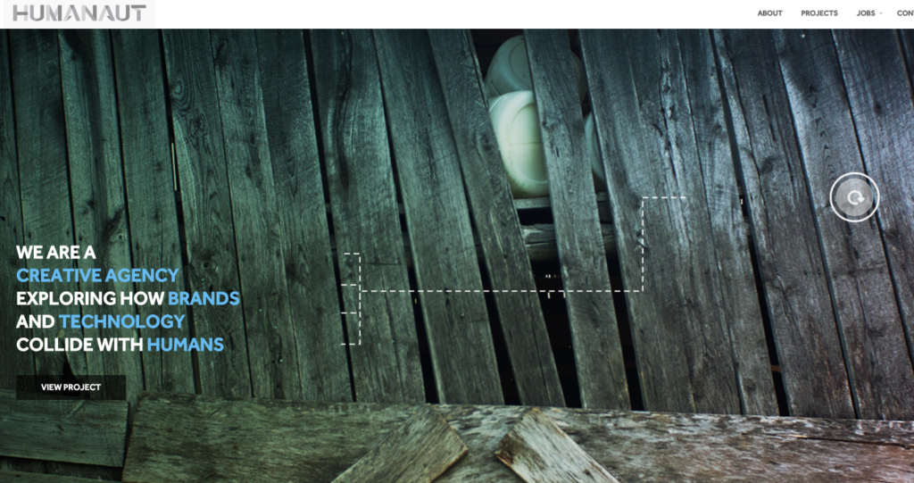
Humanaut – A ‘cool” agency.
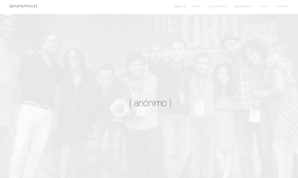
Anonimo – Possibly Mexico’s leading creative agency. They, um, do not need to overpopulate their website.
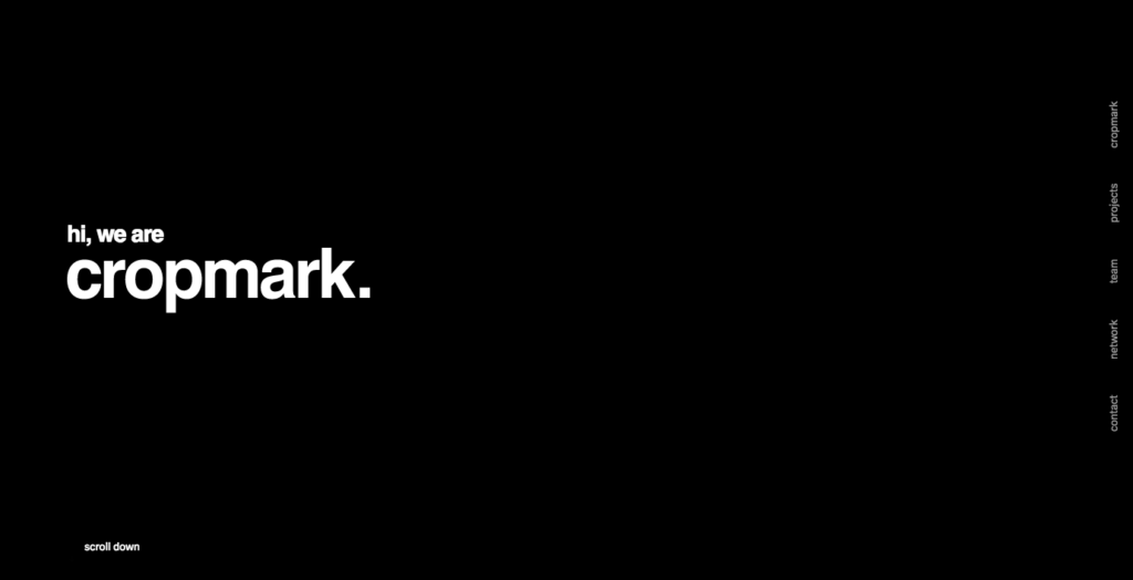
Cropmark – Yes, a European design agency.
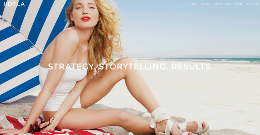
HDF.LA – A fashionable L.A. based lifestyle agency.
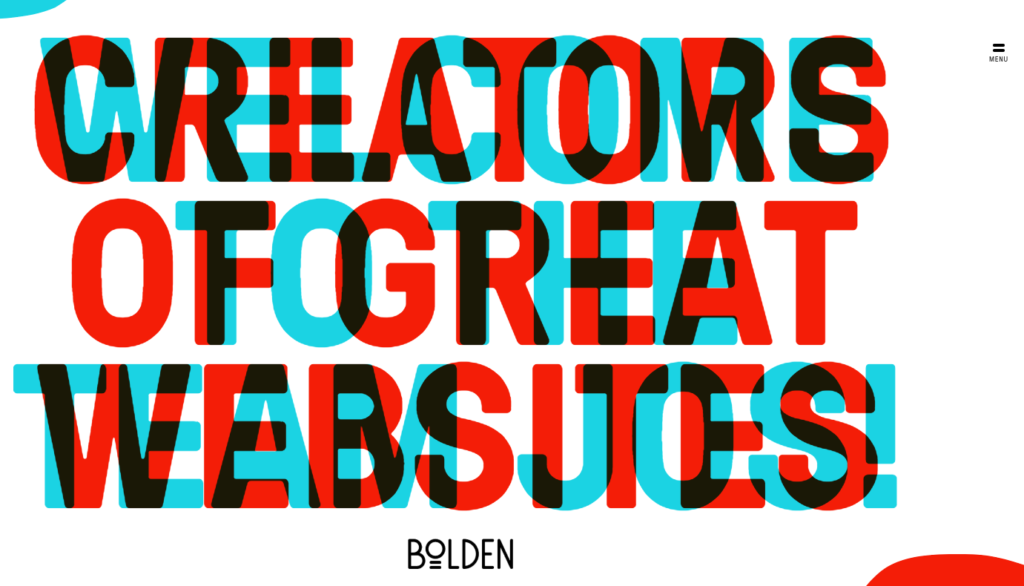
Bolden – Impossible to ignore.