• Skip to primary navigation
  • Skip to main content
  • Skip to primary sidebar
Peter Levitan & Co.

Peter Levitan & Co.

The New Business of Advertising

  • Contact
  • Blog
  • Podcast
  • My Story
  • Resources
  • Show Search
Hide Search

Search Results for: website

The Advertising Agency Website Walrus Style

Peter · December 3, 2020 · Leave a Comment

An EY Podcast Just Asked Me “What Is Missing From The Advertising Industry Today.” I Said Creativity. Ya Know, Ideas That Grab Attention And Move People. I See This Missing Link Also Running Rampant In The Advertising Agency Website Ocean. Then I Found Walrus.

I am feeling ranty these days. And,advertising agency website have this particular rant that I often repeat to my agency clients… GET UNIGNORABLE. The amount of sameness in the world of the advertising agency website world is numbing. This is a bad thing since prospective clients do most of their agency selection before they ever pick up the phone.

Welcome To The Walrus Advertising Agency Website.

Since New York’s award-winning agency (important awards) walks the creative talk and is in fact unignorable… I’ll just go fast here.

So, what works for Walrus?

  • What you first read when you look them up – as in their Google snippet = “World famous creative shop located in Union Square New York City. Where clients go to get rich, ideas go to get famous, and bivalves go to get devoured.”  Different + benefit-driven and what other agency mentions clams?
  • The Home Page has a talking Walrus. Cute. It works as a branding element and a very fast way to get you to ask, WTF?
  • Need more info? The social-style information links on the bottom of the page take you to the Walrus Facebook, Twitter, Instagram, Medium accounts, and an email thingy. Walrus does not need the endless number of website pages to tell you who they are.
  • Walrus is all about the work. Human, funny and, oh so not data-crazed, yadda yadda sameness… the advertising you see for brands that most other agencies world kill for is smart. Did I say funny? Like Walrus’ ads get a viewer to stop and watch, listen absorb. These ‘ads’ will also get the attention of the right clients. It’s kinda good for agencies to know what type of clients they want.

The Unignorable Walrus Thing.

The Walrus vibe is cool and interesting and, repeating myself, gets the attention of the right client. I am thinking that this means a client looking for strategic / creative brains.

I am not alone in preaching that advertising, digital PR, you name it agencies, need to get a bit specialist to make it in 2021. I talk about ad agency positionings here. I also say that trying to be known as a ‘creative’ agency isn’t easy. Creativity is very subjective. That said, the right client for Walrus will find them and will dig the creativity and want some of that. It is called mating. Mating requires a bit of unignorability.

OK, OK, I Know You Want To Know How Walrus’ Mate.

I had to find out. So, I went to How Stuff Works. Here you go…

The remaining females congregate on the ice pack and prepare to be entertained by the males in the water. One or two males generally perform for each congregation of roughly 23 females — presenting a series of vocalizations both above and below water. Here, the males’ pharyngeal muscles (near the throat) come in handy both as flotation devices and as amplifiers. The males simply inflate the pouches to remain upright in the water and begin to serenade.

If you woulld like to see another unignorable advertising agency website (from 2011), check out how BooneOakly used YouTube. 

Oh, did this work? 1,372,449 views so far.


Advertising And Marketing School Website Page Speed

Peter · July 26, 2020 · 2 Comments

A Slow Website Page Speed Will Hurt Your Google Ranking

Website page speed testHere are three test tools that will help you determine your website page speed.

Do you know how fast your website download speed is and how its performance ranks against your competitive agencies? Here’s the drill. If your site takes too long to download, it will lose some traffic.

Google PageSpeed Insights. Start here.

Google’s Mobile-Friendly Test. Here’s another very important test. If you are like me, over 20% of your website visitors are looking at you on a mobile device then you better make sure that they are digging how fast your website loads.

BROWSEO. We might be getting a bit geeky here. That said, BROWSEO helps you view any web page like search engines see it. The tool helps you to identify issues with your site and with your current and future clients’ websites.

Links are here on my Resources page.

You can see the growing list of all of my Advertising Stories podcasts right here. Use the handy subscribe buttons that we’ve placed on this wonderful page. 

A nice thing… Feedspot has already recognized Advertising Stories as being a top 15 advertising podcast.

The Best Advertising Agency Website

Peter · September 10, 2017 · 1 Comment

The Best Advertising Agency Website… Sells

SIMPLEI’ve been talking to an increasing number of advertising agencies about how to rebuild their agency website to be a more effective sales tool – to be a best advertising agency website. The operative word here is – sales. It is critical that agencies think very hard about how to funnel a visitor from ‘just visiting’ to making direct contact.

Your website is most likely the first time a prospective client will spend the time to get to know your advertising, design, PR or digital agency. It could also be the last time they see you, and worse, you might never know that they even took a look.

Getting your website right is critical to growing your business. Not setting it up to sell could be one of your worst business development mistakes.

Here are some general thoughts about how to turn agency websites into sales tools. I know that this is timely because most agencies, even ones that just launched a new website last week, are always thinking about their next website. I’d bet that you are too.

The Optimal Agency Website

8 Seconds…

Prospective clients give an agency website about 8 seconds to hook ‘em. That means 8 seconds to describe the agency and give the prospect a good reason to read on. 8 seconds! You know what I’m talking about… you probably give most sites you visit just 8 seconds to tell you why you should stick around.

Once you’ve hopefully sparked interest, clients look hard at agency websites for a clear understanding of what you can do for them (your skills); who you have worked for (proof); past work (more proof), agency thinking (brains); who runs the shop and agency personality (chemistry).

Once you’ve satisfied a potential client’s information needs, you will need to corral them into making contact. After looking at hundreds of advertising agency websites over the years, I can tell you (no surprise) that the great majority do not employ the basics of site visitor conversion. Most agency websites do little more than offer a very basic contact page to, hopefully, help the client make contact.

Sorry, it isn’t that simple.

Some Website Food for Thought

You have limited time to capture the attention and interest of a visitor. How do you do that? Here are some ideas.

Simple Works Hard

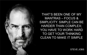
I am a fan of simple, fast read design. It’s hard to argue with the power of simplicity. As support, here are some words from the master of keep things simple.

“That’s been one of my mantras—focus and simplicity. Simple can be harder than complex. You have to work hard to get your thinking clean, to make it simple. But it’s worth it in the end, because once you get there, you can move mountains.” – Steve Jobs

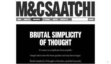
Here is an example of an agency that not only preached simplicity; it used super clean and direct design to support its very own brand proposition.

m&c sattchiSee how M&C Saatchi tells (well, once told) prospects what they will get from the agency as soon as the visitor hits the home page. M&C Saatchi delivers its message in about 1.5 seconds. Given the main message, could you imagine the agency having a complicated design to express this thought?

Maurice called the delivery of simplicity: One-Word Equity. This was their pitch from a few years ago. And, there can be no argument that his direct statement still works in today’s over-stimulated ADHD world.


OK, One More Uber Simple Website…

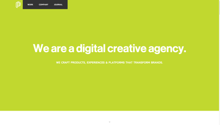
 playgroundJust to hammer the KISS point, I am including the home page of Playground. It took me 1 second to know what Playground is.

While I am not sure that saying “We are a digital creative agency” is a standout agency pitch, it is, without question, direct and therefore stronger than the front door of most agency websites.

What I Like: Website Elements

Once you have stopped the website visitor with your direct home page message (something compelling via copy or a video), you’ll have the time to tell them your agency story and supply key information.

Services

[Read more…] about The Best Advertising Agency Website

3 Ad Agency Websites That Work

Peter · March 14, 2017 · Leave a Comment

Inspiration: 3 Ad Agency Websites That Work

Screen Shot 2017-03-14 at 4.35.20 PMYes, another post on ad agency websites. This time I am writing about three very different approaches. All work. How do I know this? These agency sites deliver via unique approaches at a time when many agency websites act more like a ‘me-too’ non-sales oriented brochure. To start, here are some of my key website success points.

You will only get 8 seconds of a prospect’s attention. So, state your reason for being — fast.

That means, KISS — Keep It Simple Stupid.

Walk your talk.

Help me to want to meet you.

Try to look and sound different. The sameness of agency website messaging, look and attitude is distressing.

Your website is a sales tool. Worth repeating. It is a sales tool.

Use video to tell your story.

If you dig social, then deliver some highly targeted thought leadership. Provide more substance than a ‘me-too’ agency blog.

Entice a prospect to contact you. Friendly sales works.

The 3 Agency Websites.

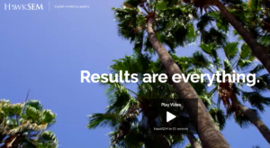
1. HawkSEM


Screen Shot 2017-03-14 at 2.50.46 PMHawkSEM is a digital / PPC marketing specialist based in L.A.

Here is why I dig the HawkSEM website.

  • Slavish devotion to the agency’s Results / ROI positioning. That means their messaging supports their stance. As in: “No BS, just Results. Average Clients see a 4.5x ROI”
  • The positioning is client focussed.
  • Massive use of videos. Mucho people to watch on this site.
  • Sexy client list plus relevent cases plus video testimonials.
  • Very serious Google endorsement.
  • They ask for the order via simple offer… “Request a free consultation.” Not just the usual, all too usual, “Contact Us.”

This approach makes them successful.

2. Wise Branding Group

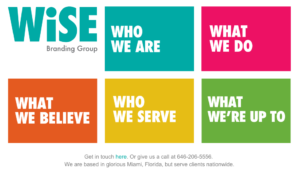
Screen Shot 2017-03-14 at 3.43.06 PMI’d never heard of Betsey Wise until I read her right-on quote in Ad Age’s “Agency Nostalgia Hits SXSW.” See what I mean (as in, this must be the dream of every employee working at WPP or Publicis):

“And this is what’s wrong with the agency model,” said Betsy Wise, CCO of her own branding group. “Too many people in a meeting, and not enough getting done.”

Ms. Wise was just joking about the room too full for her to even enter, but she was also kind of serious. She was there to talk about what agency workers can do to overcome the waning influence of their industry. She used to be in it, until she started her own company, and now sets her own hours.

“I’m working 30 hours a week, and I’ve easily doubled my salary, maybe tripled,” Ms. Wise said.”

Here is why I dig the Wise Branding Group website:

  • Super clean design.
  • The site’s navigation elements are the graphics / the graphics are the navigation.
  • Who We Are. / What We Do. / What We Believe? / Who We Serve / What We Are Up To.  Is kinda all you really need to know.
  • I like the copy and its tone.

More? Could Wise add more stuff? Sure and it might help. Or, um, distract.

3. Joan.

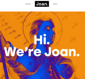
Screen Shot 2017-03-14 at 4.13.11 PMMore women. I am only saying this because Joan. celebrates women. Especially women named Joan. Need rationale?

“Throughout history, various Joans have shown up on the scene and completely changed the landscape — from rock and roll, to comedy, to helping put a new face on the protest movement of the 60s, and of course, to our favorite Joan, who triumphed on the French battlefields. These Joans knew that the combination of talent, ambition, curiosity, imagination, an eternal work ethic and a completely irregular perspective from the norm would allow them to question, challenge and change.

We take inspiration from these incredible women. And we hope to do some good in their name.”

Here is why I dig the Joan. website:

  • The name is intriguing.
  • The founders are named Lisa and Jaime.
  • Interesting, non-standard-resumes: “What happens when one of Fast Company’s Most Creative People in Business and Refinery29’s former COO start an agency?” And leadership positions at Widen + Kennedy and Pereira & O’Dell and Ogilvy and Mather, Saatchi and Saatchi, BBH NY and Fallon.
  • Sweet, diverse client list that includes: General Mills, Unilever, Jack Daniels, Coca-Cola, and Intel.
  • Joan. walks the talk. They are establishing: “The Joan Foundation for Diversity in Advertising.”

Ok, I admit it. Much of what I dig is Joans.’s straight forward approach to all of the reasons I’d give them a call. The site is tight.

Minimalist Advertising Agency Websites

Peter · February 1, 2017 · Leave a Comment

Minimalist (Advertising Agency) Websites

Screen Shot 2017-02-01 at 9.18.24 AMSay this out loud:

“Your advertising, digital or design agency has only about 8 seconds to get the attention, interest and then drive an action from a website visitor.”

That is what 8 seconds in the land of website lead gen looks like.

I have been studying the design and sales savvy of advertising agency websites since the mid-1990’s. Over time the advertising world has seen the gamut of design directions. Super static to (over-used) FLASH to today’s (over-used) WordPress themes with their ubiquitous vertical scrolling. After looking at hundreds of websites, I’ve concluded that minimalist websites that deliver easy to digest interest win.

Sameness.

While every agency wants to have a truly kick-ass website, many, if not most, look alike – or, at least, share a small range of key elements. There are many reasons for this. Agencies love the latest shiny design object (back to scrolling and carousels); agencies essentially say the same thing (note the similarity of brand positions and sales propositions) and many website designers are looking at competitor sites for inspiration. They also scour the website awards sites including:

Awwwards.

CSS Design Awards.

CSS Winner.

FWA.

The Webby Awards.

Communication Arts.

Wow, that should keep you busy.

It’s Sales Stupid.

Design sameness aside. Regardless of what design direction an advertising agency is using – the agency website must first and foremost act as an effective sales tool. You’d think this would go without saying. But…

As I have pointed out, your agency website might get no more than a 8 second ‘hard’ look by a prospect. Because of this,  I have come to the conclusion that the most effective approach is for an advertising agency to design with one thought in mind: K.I.S.S., Keep It Simple Stupid. I will highlight a few lean and mean websites below. But first, here is my one-note advertising agency website design wish list.

Simple (and fast) is good. I am a fan of simple, fast read design. If all you have is a few seconds, you better use that brief time to your advantage. While there is no ‘perfect’ home page, I suggest that this is when you better tell your story. Just to point to one website that gets this need for simplicity, I point you to M&C Saatchi’s website. This agency simply wants you to know that they are important.

Deliver Your Sales Message. Virtually every agency I work with points to Droga5 as being a favorite. OK, we know that they are good at what they do. But, as of today, one thing they do do is to tell a website visitor that they win awards. I don’t care how sophisticated a client is. They love agencies that win third-party awards. Proof of success. Full stop.

Chemistry wins. I made a big point in my book on presenting and pitching that interpersonal chemistry is often the deciding factor in agency selection. Why is this? Well, again, most agencies are kinda alike and when pitching they share very similar attributes based on the client’s initial selection criteria. And, let’s face it, pixels aside,… people buy people. Being liked is nice. So, why not use your website to introduce your interpersonal chemicals. London Advertising does this.

A Minimal Minimalist Website List.

I am not going to re-belabor the minimalist point. Here are just a few that work for me. This isn’t an extensive list. I am just providing a look at UBER minimal to show that less can be more. Sorry, I had to say that.

(By the way, sorry for the spacing below. WordPress is failing me — funny in a post about website design.)

Humanaut – A ‘cool” agency.


Screen Shot 2017-02-01 at 9.57.33 AM

Anonimo – Possibly Mexico’s leading creative agency. They, um, do not need to overpopulate their website.

Screen Shot 2017-02-01 at 9.59.28 AM


Cropmark – Yes, a European design agency.

Screen Shot 2017-02-01 at 10.00.53 AM


HDF.LA – A fashionable L.A. based lifestyle agency.

Screen Shot 2017-02-01 at 10.04.46 AM


Bolden – Impossible to ignore.

Screen Shot 2017-02-01 at 10.08.28 AM

  • Go to page 1
  • Go to page 2
  • Go to page 3
  • Interim pages omitted …
  • Go to page 59
  • Go to Next Page »

Primary Sidebar

  • Featured
  • Resources
  • Podcast
  • The Six Best Books On Branding
  • A Sad Advertising Agency Business Development Story
  • How Does A Personal Brand Work? Ask Gary Vaynerchuk & David Droga
  • Is Your Advertising Agency Findable?
  • The Big Advertising Agency Resource List
  • The 9 Best Consumer Insight Definitions
  • The Big Advertising Agency Resource List
  • Moving To Mexico
  • Advertising Agency Process and Profitability
  • What Is Your Elevator Pitch
  • Random Marketing And Advertising Resources
  • Advertising Agency Podcast Guide
  • Bob Hoffman | The Ad Contrarian On Advertising Agency Presentations And Pitching
  • How To Be A Brilliant Podcast Guest
  • Want Advertising Agency New Business Leads? The Ratti Report Delivers
  • How To Manage A Brain On A Zoom Sales Meeting
  • YES! You Can Run A Powerful Zoom Meeting
  • How To Win A Mobile Dating App Client – On Zoom

Post Archive

Subscribe

Subscribe to the Advertising Stories Podcast

Apple PodcastsGoogle PodcastsSpotify

Contact

Email Peter
Connect on LinkedIn

Peter Levitan & Co.

Copyright © 2023 • All Rights Reserved • Peter Levitan & Co. • Log in