The Best Advertising Agency Website… Sells
 I’ve been talking to an increasing number of advertising agencies about how to rebuild their agency website to be a more effective sales tool – to be a best advertising agency website. The operative word here is – sales. It is critical that agencies think very hard about how to funnel a visitor from ‘just visiting’ to making direct contact.
Your website is most likely the first time a prospective client will spend the time to get to know your advertising, design, PR or digital agency. It could also be the last time they see you, and worse, you might never know that they even took a look.
Getting your website right is critical to growing your business. Not setting it up to sell could be one of your worst business development mistakes.
Here are some general thoughts about how to turn agency websites into sales tools. I know that this is timely because most agencies, even ones that just launched a new website last week, are always thinking about their next website. I’d bet that you are too.
The Optimal Agency Website
8 Seconds…
Prospective clients give an agency website about 8 seconds to hook ‘em. That means 8 seconds to describe the agency and give the prospect a good reason to read on. 8 seconds! You know what I’m talking about… you probably give most sites you visit just 8 seconds to tell you why you should stick around.
Once you’ve hopefully sparked interest, clients look hard at agency websites for a clear understanding of what you can do for them (your skills); who you have worked for (proof); past work (more proof), agency thinking (brains); who runs the shop and agency personality (chemistry).
Once you’ve satisfied a potential client’s information needs, you will need to corral them into making contact. After looking at hundreds of advertising agency websites over the years, I can tell you (no surprise) that the great majority do not employ the basics of site visitor conversion. Most agency websites do little more than offer a very basic contact page to, hopefully, help the client make contact.
Sorry, it isn’t that simple.
Some Website Food for Thought
You have limited time to capture the attention and interest of a visitor. How do you do that? Here are some ideas.
Simple Works Hard
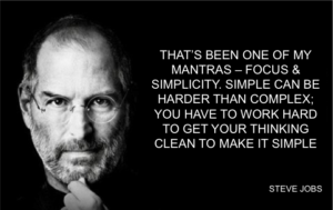
I am a fan of simple, fast read design. It’s hard to argue with the power of simplicity. As support, here are some words from the master of keep things simple.
“That’s been one of my mantras—focus and simplicity. Simple can be harder than complex. You have to work hard to get your thinking clean, to make it simple. But it’s worth it in the end, because once you get there, you can move mountains.” – Steve Jobs
Here is an example of an agency that not only preached simplicity; it used super clean and direct design to support its very own brand proposition.
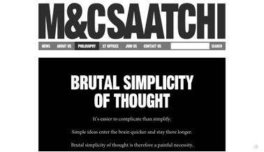 See how M&C Saatchi tells (well, once told) prospects what they will get from the agency as soon as the visitor hits the home page. M&C Saatchi delivers its message in about 1.5 seconds. Given the main message, could you imagine the agency having a complicated design to express this thought?
Maurice called the delivery of simplicity: One-Word Equity. This was their pitch from a few years ago. And, there can be no argument that his direct statement still works in today’s over-stimulated ADHD world.
OK, One More Uber Simple Website…
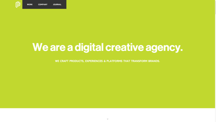 Just to hammer the KISS point, I am including the home page of Playground. It took me 1 second to know what Playground is.
While I am not sure that saying “We are a digital creative agency” is a standout agency pitch, it is, without question, direct and therefore stronger than the front door of most agency websites.
What I Like: Website Elements
Once you have stopped the website visitor with your direct home page message (something compelling via copy or a video), you’ll have the time to tell them your agency story and supply key information.